
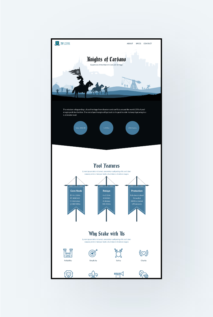
Platform Responsive Website Type Industrial Project Period 1 week | Knights of Cardano: Responsive Website Design Case Study This is a real-world project to design the website for Knights of Cardano - a cryptocurrency stake pool, and built on Webflow. |
 MY ROLE
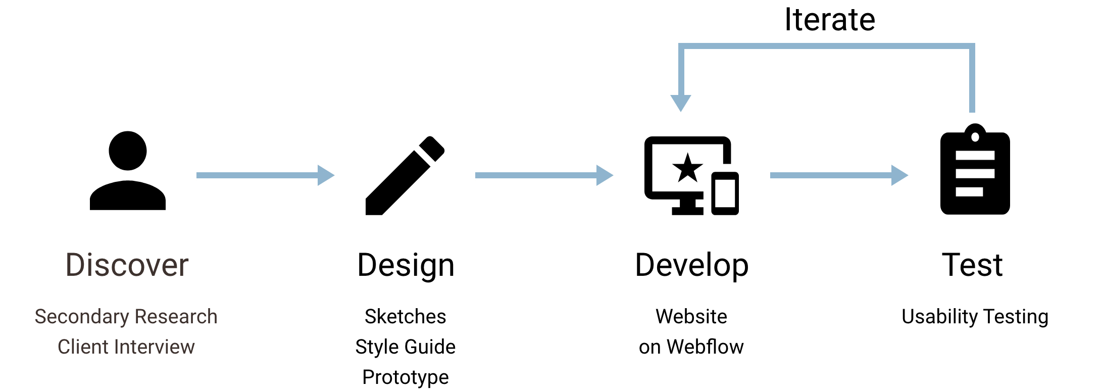
As the sole designer and developer in this project, I started with a secondary research to find out what kind of information should be included in a stake pool website.
Based on the result of the secondary research and the requirements of the client, I made some sketches, created a style guide, and made a high-fidelity prototype. After the website had been built on Webflow, usability testing was conducted to eliminate any possible usability issues.
THE SOLUTION
"A stake pool with the mission of guarding cultural heritages."
DESIGN PROCESS
DISCOVER
To understand what information the users are looking for, I conducted a secondary research on the cryptocurrency investors.
According to a research on the demography of the cryptocurrency investors, compared to average internet users in Europe, cryptocurrency investors are more likely to be young professionals in IT, engineering or finance, with higher educational and income level. However, this stereotype is being challenged by increasing diversity.
I conducted a one-hour interview with the owner of the stake pool, to learn more about his requirements for the website and the charity mission of the pool.
The interview questions were focusing on the content and the style of the website. As the charity mission of the stake pool is to protect the world's historical and cultural heritage, I suggested to the client to use a medieval knight theme and a minimalist design.
DESIGN
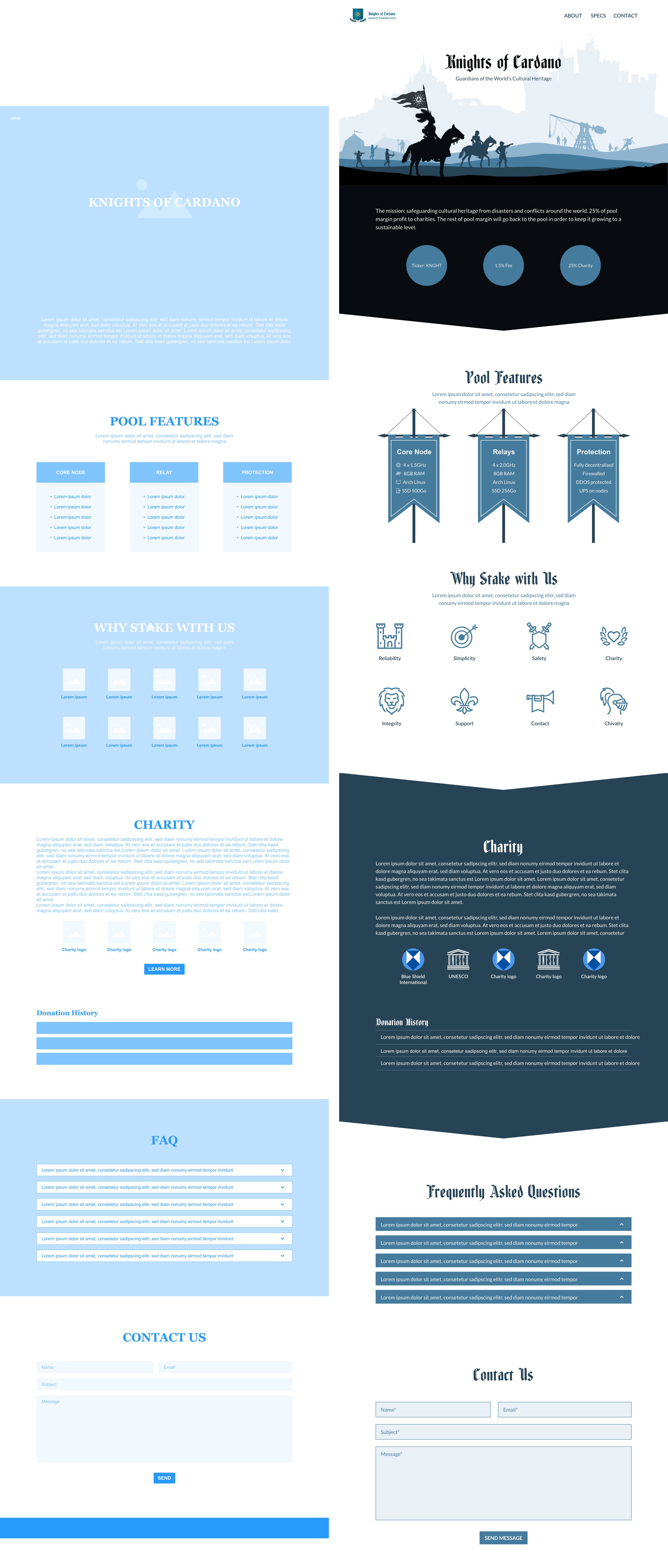
I created a color palette based on a pastel grey-blue primary color to combine the medieval style and the feeling of modern technology.
I made a quick sketch of the homepage according to the content list, and created a mid-fidelity wireframe. After that, a high-fidelity prototype was created using the style guide.
DEVELOP
I adapted the content and design during the development following client needs, and built the website on Webflow.
Changes made:
- Added the pool information and an easy copy feature;
- Added the association memberships;
- Introduced a yellow highlight color;
- Separated "Pool Specifications" and "Why Stake with Us";
- Added the information of pool operator;
- Re-organized the menu.
TESTING
I conducted the usability testing with the client -- the experience was smooth!
FINAL PRODUCT

NEXT STEPS
The website is up and running well at the moment, but for future developments, there are a few more things can be done:
- Adding parallax effect to the landing page to create more interaction;
- Adding news feed.

