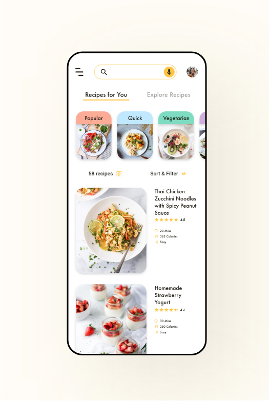
Platform Mobile App Type Design Sprint Period 1 Week | Savr Recipes: A One-Person Design Sprint Savr Recipes is a smart cooking sidekick that not only offers personalized recipes and step-by-step cooking guidance, the highly practical voice control feature also allows users to refer back to the recipe hands-free during cooking. |
MY ROLE
I took this challenge to redesign the Savr Recipes app by conducting a 5-day design sprint. The process is fast-paced, lean and agile, with one major activity per day
My role in this project covers mapping, sketching, prototyping, and testing. My main deliverables include experience map, sketches, prototype and usability testing.
THE SOLUTION
"Talk to your phone without keep washing and drying your hands."
Savr Recipes is aiming to make cooking new recipes at home easier. Besides the personalized recipes and the detailed cooking instructions, the redesigned app also offers a highly practical voice control feature where users can refer back to the recipe on the phone during cooking by just talking, saving the hassle of keep washing and drying their hands every time they wanna check something.
*For full experience, I recommend signing into your Adobe account and try out the voice control feature in this prototype, or watching the prototype video with sound on.
DESIGN PROCESS

DAY 1 MAP
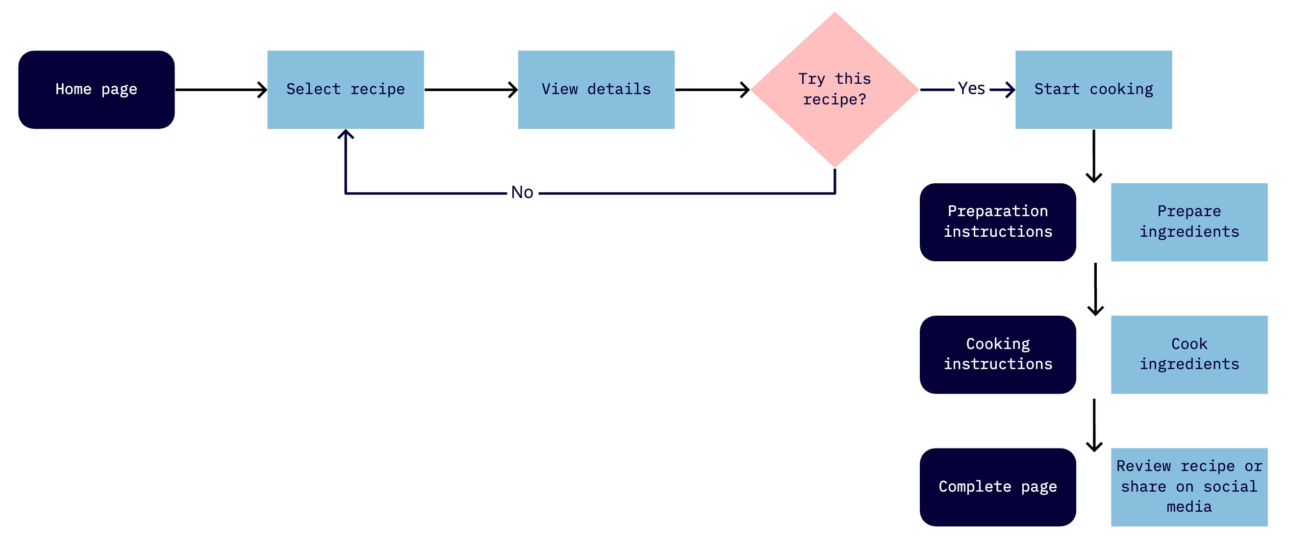
I abstracted pain points from the interview quotes, and mapped out an end-to-end experience users would have.
DAY 2 SKETCH
Lightning Demos
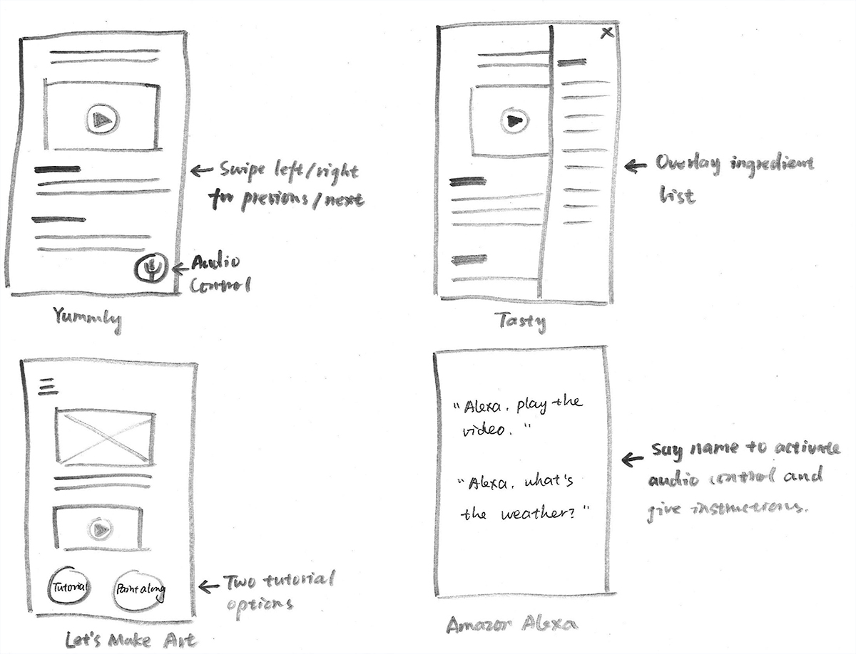
When conducting a solo-version lightning demos, I looked at products that offered similar services to the “cook-along” experience.
Lightning demos is a powerful tool to generate ideas that can solve the problem by looking at other products or services that have solved a similar problem.
To conduct a solo-version lightning demos, I looked at products that were not only related to recipes and cooking, but also those who offered similar services to the “cook-along” experience. For example, I found the idea of offering 2 tutorial options (brief tutorial and “paint-along” tutorial) by looking at a website that provides painting kits and online painting tutorials, as this "paint-along" experience is somewhat similar to following an online tutorial to cook.
Crazy 8s
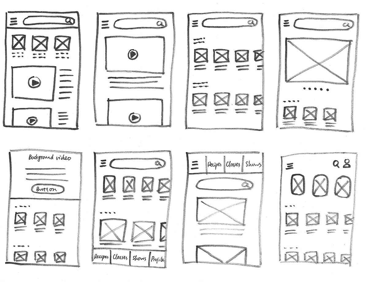
I used the Crazy 8s to sketch 8 variations of a critical screen in 8 minutes.
To generate different variations of the critical screen, I tried the Crazy 8s method. This is a method where I need to sketch 8 variations of 1 screen in 8 minutes. I folded a piece of paper 3 times to create 8 blocks, set the alarm to 1 minute per screen, and allowed myself to try different possibilities.
Solution Sketch
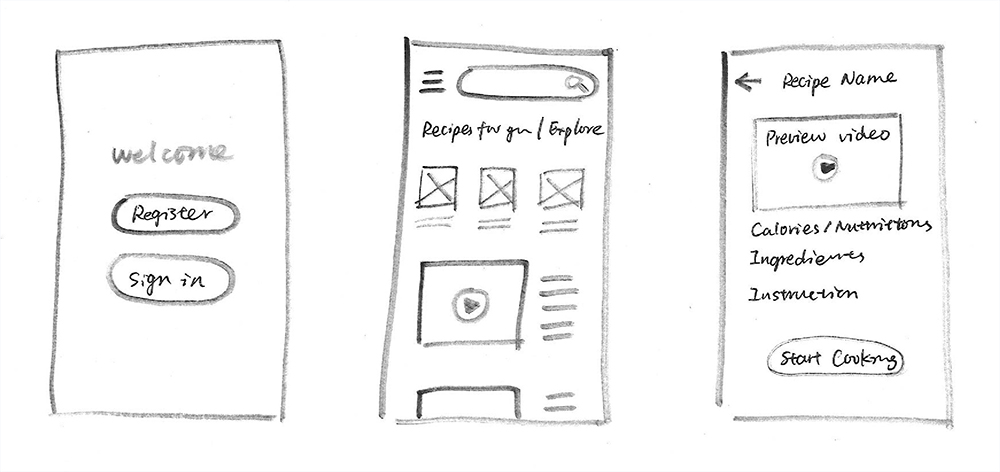
I picked my favorite style from the Crazy 8s, and sketched 1 screen before and after it.
DAY 3 DECIDE
Storyboard
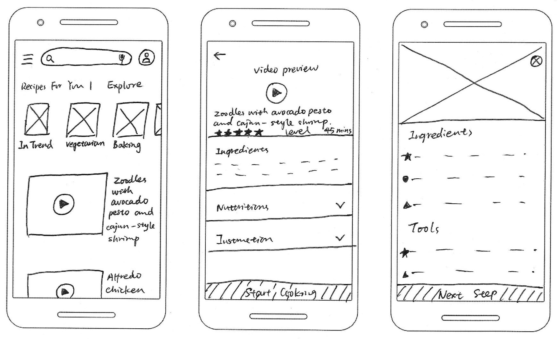
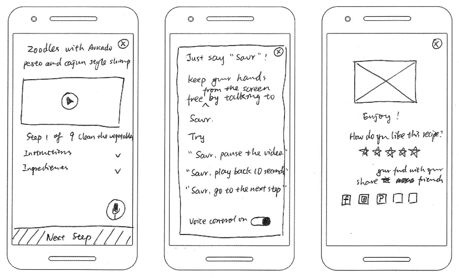
I extended the 3-panel solution sketch to a 6-panel storyboard, with a focus on solving the pain points.
Paint Points | Solution | |
1. Not sure how the food looks like during cooking. | 1. Use video tutorial so that users can see the whole process. | |
2. Need to wash hands constantly to refer back to phone. | 2. Add voice control feature. | |
3. Not sure what kitchen tools are needed. | 3. Add tool list to the recipe page. | |
4. Not sure what preparation is needed. | 4. Add cooking steps to the recipe page. | |
5. Unclear cooking instructions. | 5. Add clear instructions and video tutorial. | |
6. Unclear cooking time of each step. | 6. Add time duration to each step. | |
7. Unclear cooking techniques required in the recipe. | 7. Add a “Help” button next to the technique to give explanation. |
DAY 4 PROTOTYPE
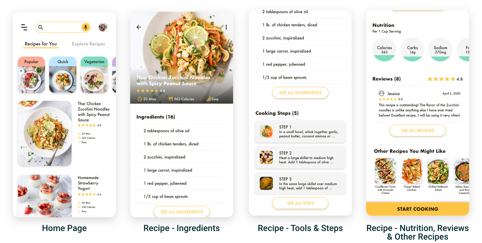
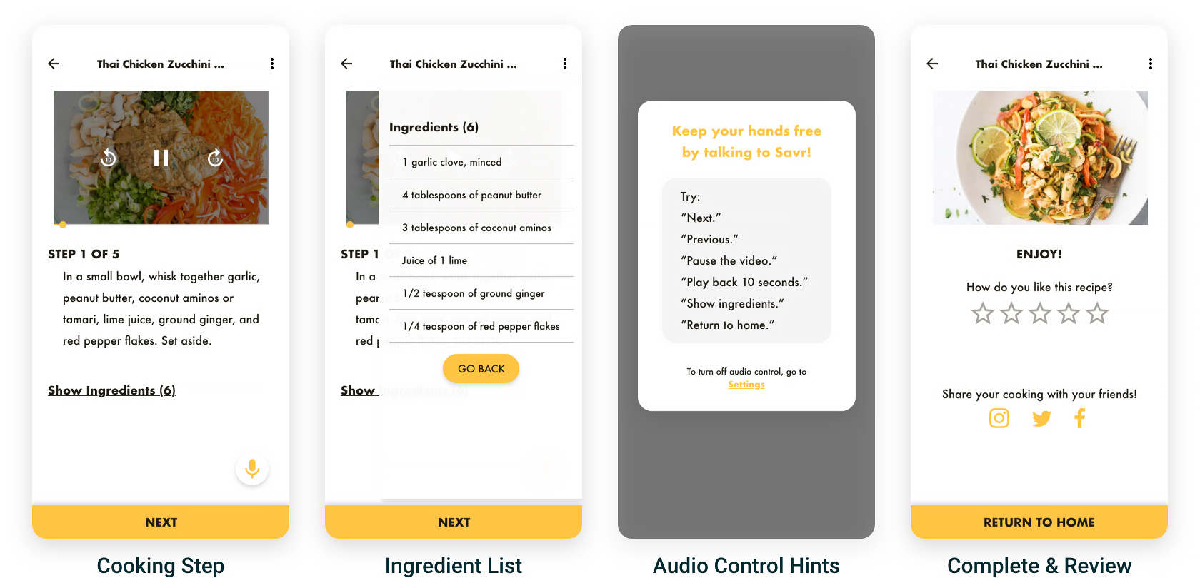
I chose yellow as the accent color as it's associated with happiness and can stimulate appetite according to color psychology.
DAY 5 TEST
To check if my solutions work well, I shared the prototype with 5 people and asked them to try "cooking along" with it.
I ran the usability testing by sharing the prototype with 5 people who had never seen the app and asked them to complete 2 tasks - finding a recipe, and imaging cooking along with the app. I observed their operations online through shared screens on Skype.
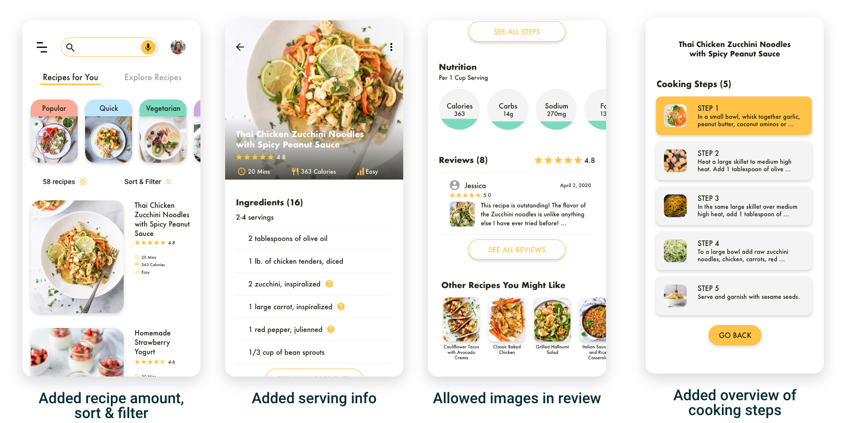
Paint Points | Solution |
1. Users can’t sort or filter the recipes. | 1. Add sort & filter feature. |
2. Users don’t know how many servings the recipe is for. | 2. Add serving info to the recipe page. |
3. Users can’t add food images to their review. | 3. Allow images in the review. |
4. Users can’t jump to a step without taping “Next” and go through each step. | 4. Add a cooking step overview and allow users to choose any step. |
FINAL PRODUCT
I iterated the prototype according to the findings from the usability testing, and created the final product.
*For full experience, I recommend signing into your Adobe account and try out the voice control feature in this prototype, or watching the prototype video with sound on.
REFLECTION
Instead of mapping out every single screen and adding robust feature sets, I completed the 5-day design sprint focusing on the most critical feature - cooking along with voice control, and presented my work in the form of a realistic prototype.
The Importance of MVP
During the testing, I realized that users were already pretty satisfied and impressed by the detailed recipe and the voice control feature. For users, the most important thing is the feature they originally signed up for provides a frictionless experience. Other features are more like “nice-to-haves.The Benefits of Design Sprint
Even though I completed this design sprint alone, I can still see that for project teams, design sprint will allow them to validate the idea with real users in the short span of one week. It can be fast, flexible, and saving months of development time.NEXT STEPS
For next steps, I would like to add some features that can have a positive impact on the user experience, such as allowing users to search recipes according to what they have in the fridge.
